
OVERVIEW
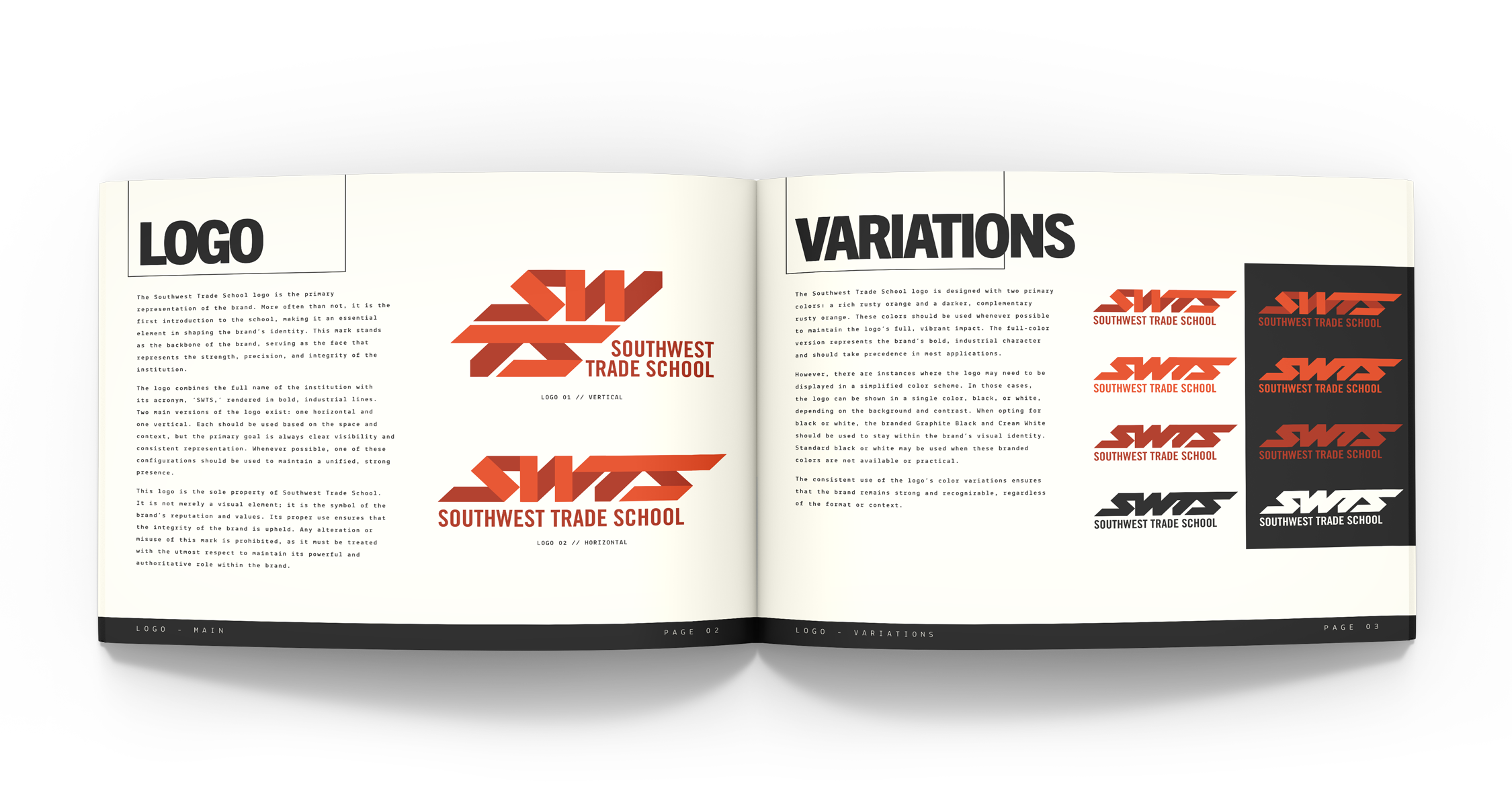
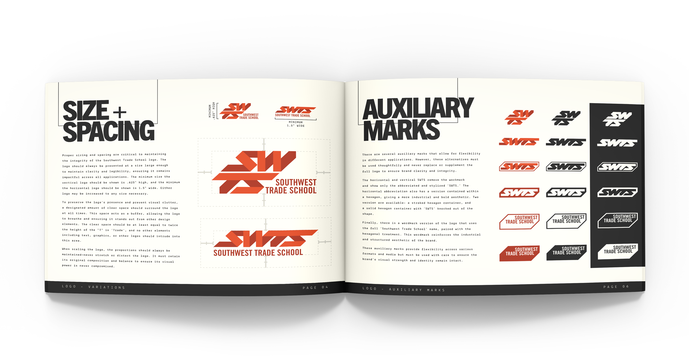
Southwest Trade School’s branding emerged as a nod to union precision and industrial strength. This styling is reflected in the clean lines of the school’s logos, reinforced by vintage fonts, and completed by hues echoing the Southwestern landscape. Designed to instill pride in students while also creating a strong presence that speaks to the legacy of the trade industries, their branding tackled the unfamiliar terrain of education with a fresh perspective. It’s more than logos and colors—it’s a foundation to strengthen brand affinity, elevate school awareness, and draw new enrollment.
SERVICES
ART DIRECTION
BRAND DEVELOPMENT
GRAPHIC DESIGN
LOGOS & MARKS

BRAND GUIDELINES


BUSINESS CARD

APPAREL

